Project Description
New Visual Identity for AGORA Telecom, one of the largest telecom equipment distributors in South America.
The new visual identity
![]()
Analysis of the last visual identity
![]()
AGORA TELECOM’s logo featured an icon on the left representing electromagnetic telecommunication waves with three ellipses ending in spikes surrounding a smaller circle and a “wave” in black. The circle in the center and the darker color emphasize the idea of an emitter, aim, target, focus.
As for the name AGORA, the italic font conveys movement, energy, and progress. The lower part of the As had been redesigned into a bridge shape, giving the sensation of a leap.

The AGORA TELECOM icon represents electromagnetic waves originating from an emission point and expanding to reach the receiver.
According to the laws of physics, waves typically expand in concentric circles.

![]()
By outlining the icon’s waves, we can see that they do not follow this principle. The shapes are not ellipses and are offset from the center, looking more like a spiral.
The waves have ends that escape the axis of a conventional ellipse.
The core is not symmetrical, and only one of the first waves is in black, unbalancing the whole image.

The A’s redesign to form the “bridge” affected the width of the horizontal bar, which was much thinner than the rest, conveying a certain fragility and unbalance.
The highlight on the As (at the beginning and end of “AGORA”) weakens the impact of the brand.
The letter R of the font used (Helvetica Neue LT Heavy Extended Oblique) has a detail on the tip of the leg that, in large sizes, can give an interesting touch. However, when the logo is scaled down, it almost disappears and can create noise in applications such as stickers or embroidered uniforms.
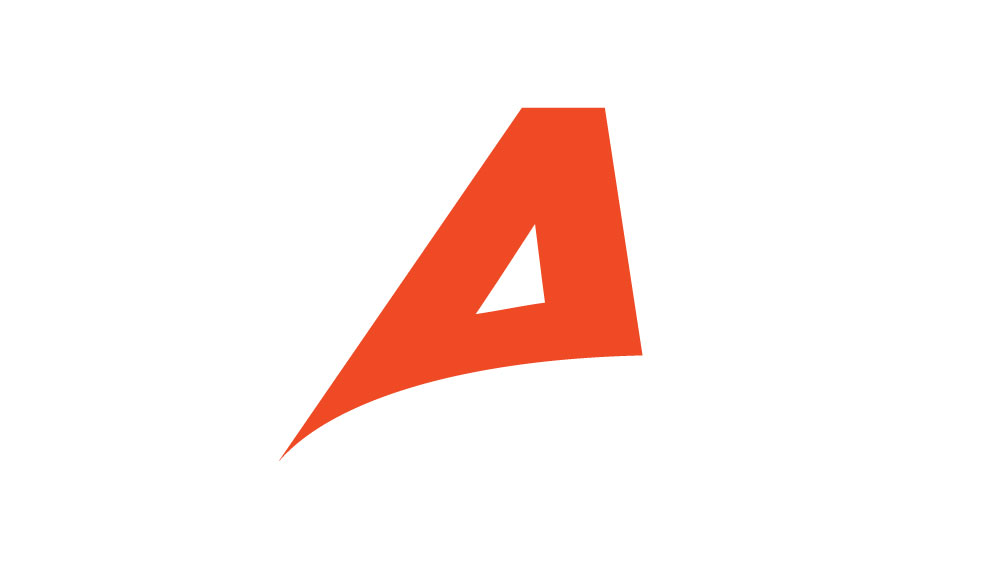
Refreshed brand
The new brand was designed considering the potential improvements listed above while maintaining the company’s identity. The wave icon was recreated to correct the shapes. The typography was simplified using a more modern, streamlined font (Gotham). The first A was redesigned seeking a new expression – it now conveys growth and can be used as an icon with a strong visual impact.
![]()
![]()
![]()
![]()
A vertical option is available too
![]()
![]()
![]()
![]()
And an icon / avatar
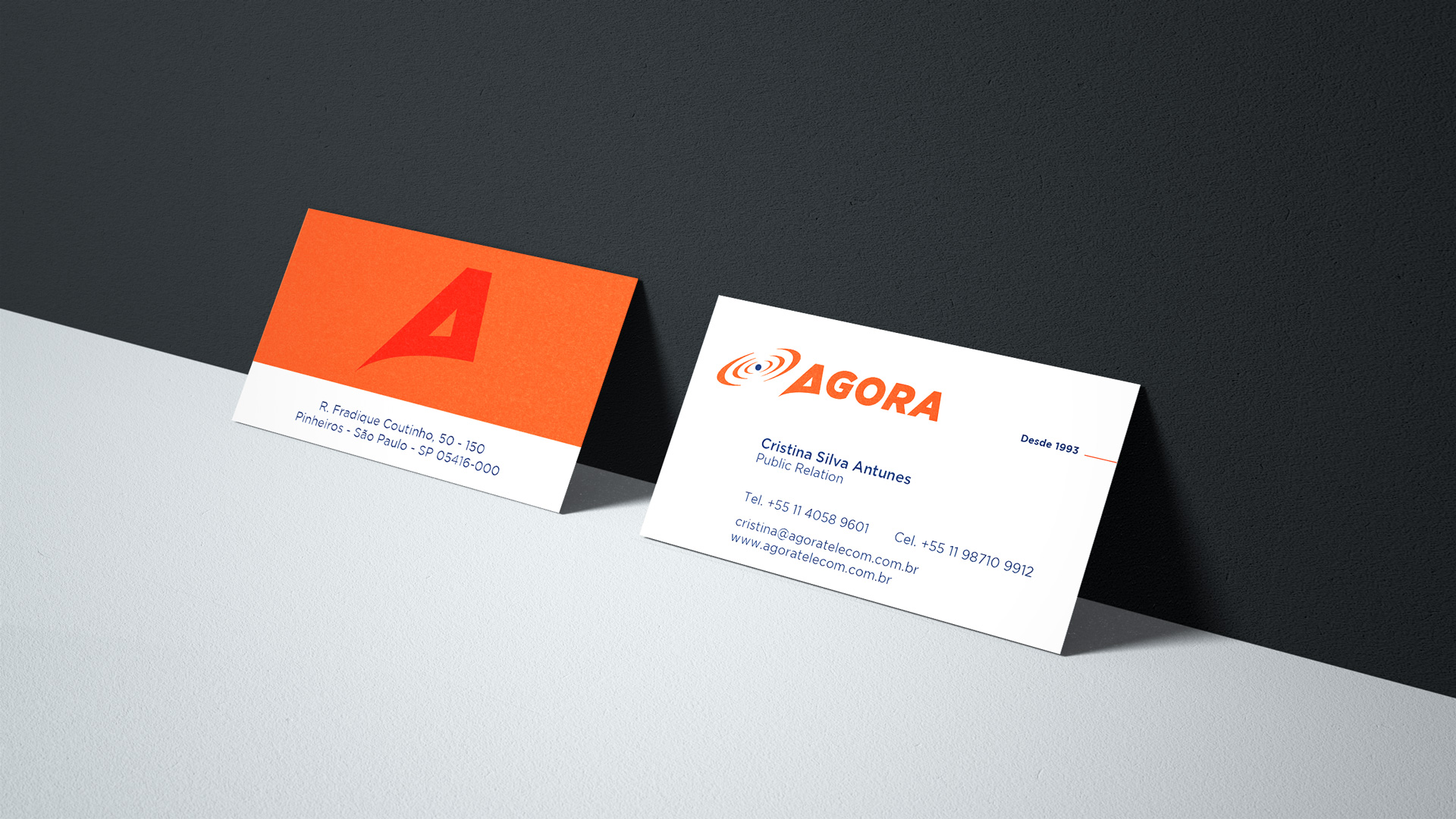
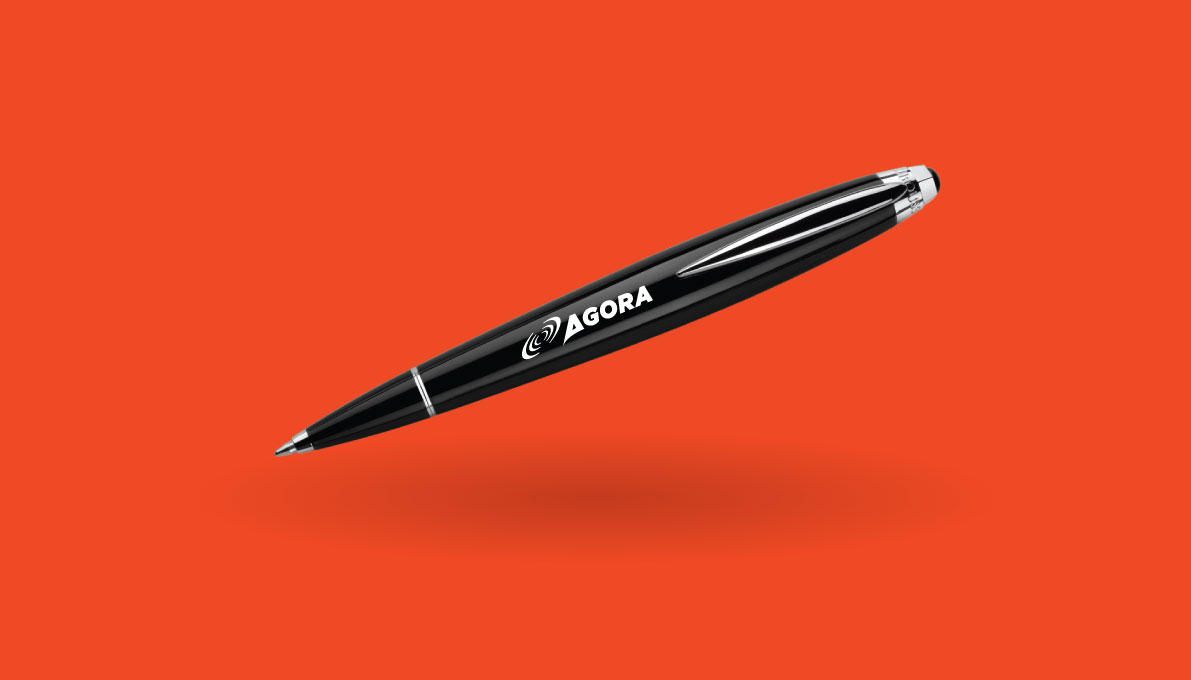
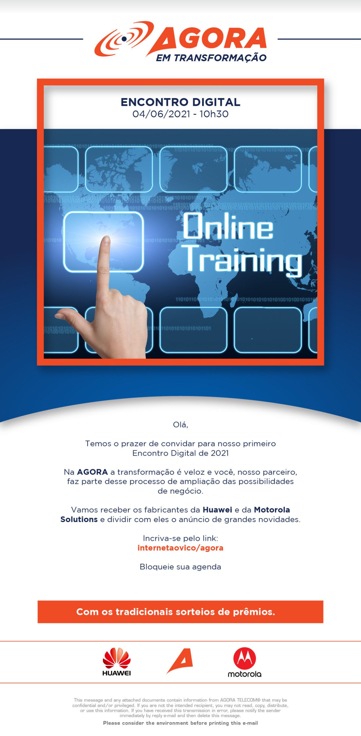
Some applications
Examples of newsletters


